Dogs Of A Good Society
Information Architecture Reconstruction and Redesign
Information Architecture Reconstruction and Redesign

The non-profit, Dogs Of A Good Society or D.O.G.S., has a goal of providing financial support to animal rescues in order to save animals in need. We have observed that the website isn’t meeting the users need to donate, find assistance, or understand what the organization does, which is causing a high bounce rate to the business.
How might we improve the D.O.G.S. website to better facilitate user donations, provide assistance, and effectively communicate the organization's mission to reduce the high bounce rate and increase support for animal rescues?
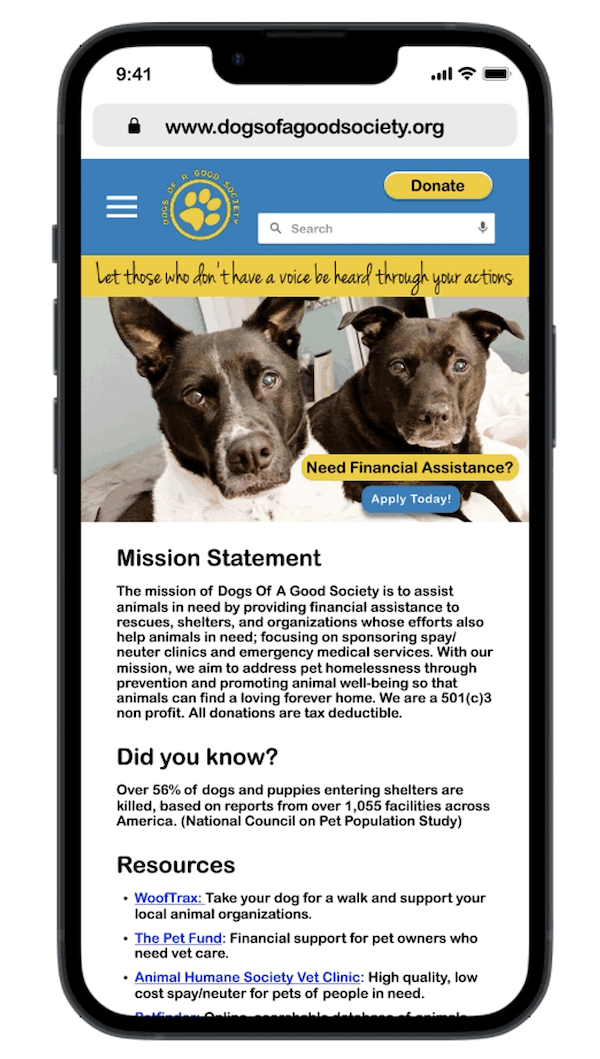
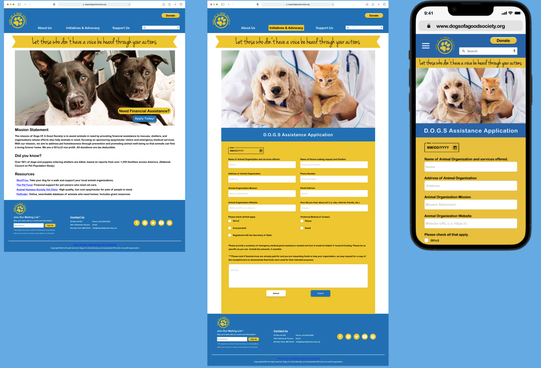
We took a human-centered approach through research and testing and conducted an information architecture (IA) reconstruction to ensure related pages were united under a simple navigation, created an in-house assistance application form, and designed a new call-to-action and hero banner to provide clarity to the nonprofit's mission.
In this research project, we planned and conducted 16 interviews with stakeholders and users, and surveyed 10 people.

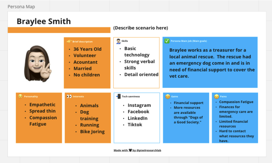
Our proto persona’s name is Braylee, a 36 year old accountant who volunteers for her local rescue. Her main priority is to find financial support to cover the vet care of a dog that came into their rescue with an emergency medical issue.
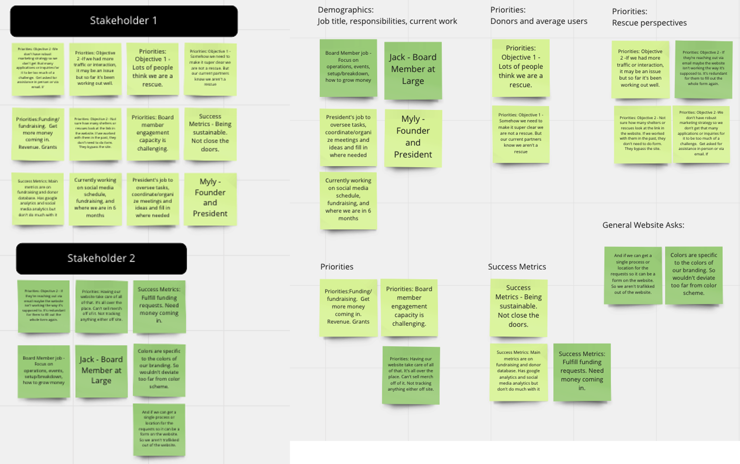
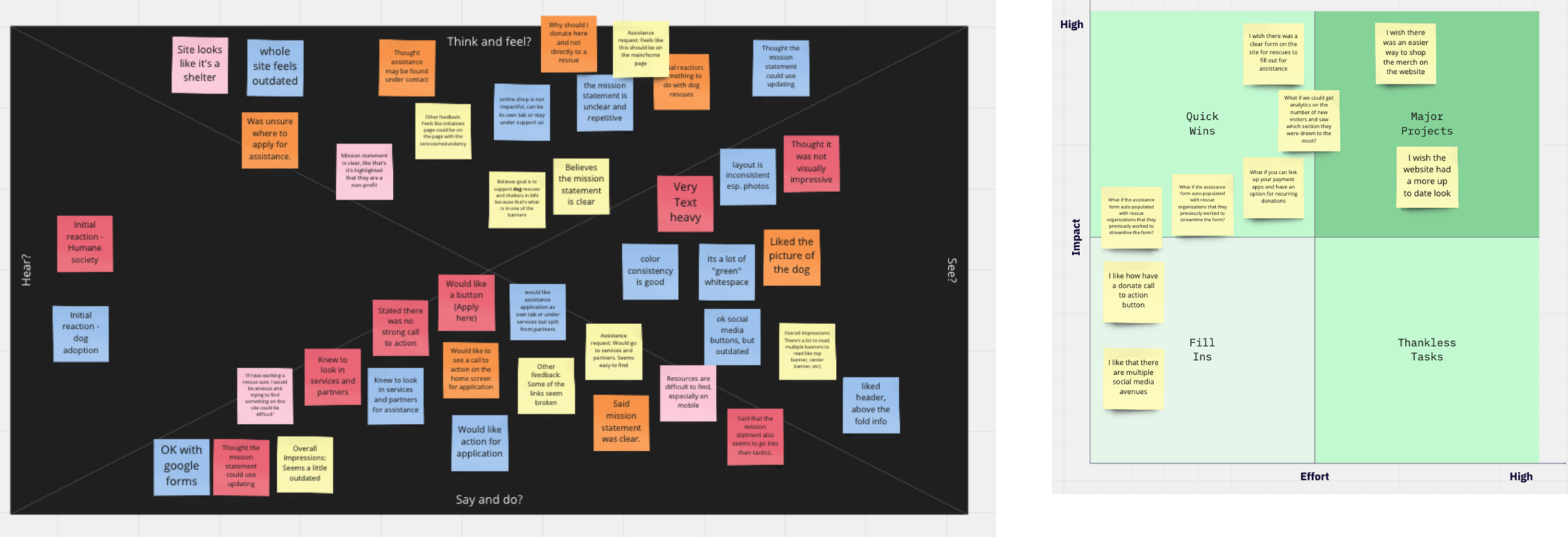
I created a user interview plan based on the pain points discovered during the stakeholder interviews. Based on the empathy mapping session, we did some feature prioritization work to determine which areas we wanted to tackle based on feasibility, the stakeholder input, and what we learned from the user interviews.
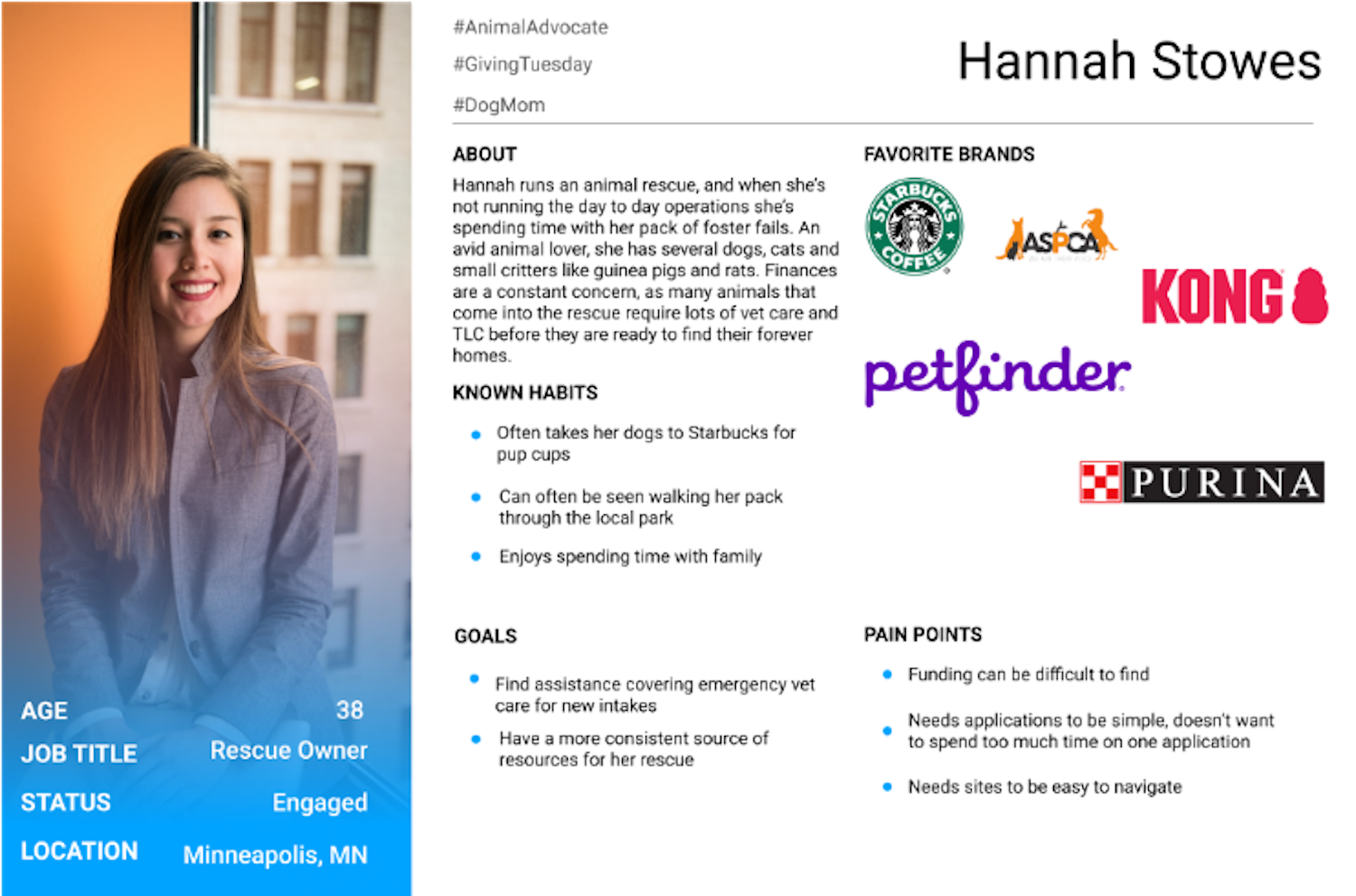
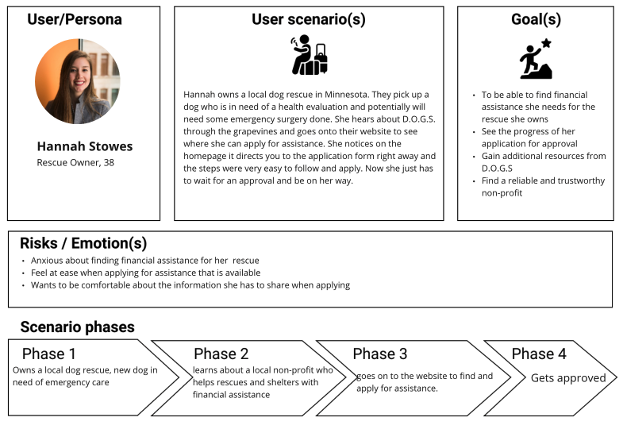
Utilizing the information gathered from the user interviews, I transformed the prior proto persona into a user persona. I further defined the user persona to also create user scenarios, goals, and scenario phases.
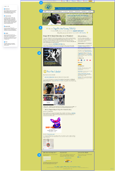
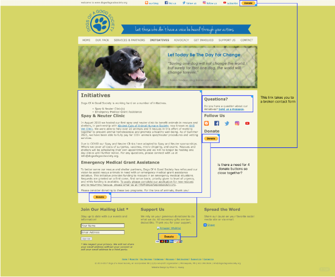
I conducted a heuristic analysis on each page of their site and saw a lot of recurring themes in terms of what could be improved:
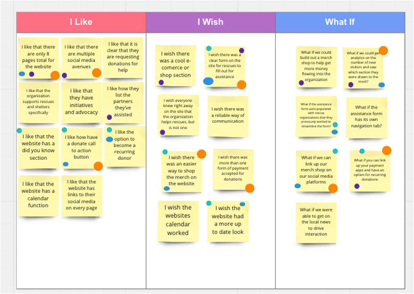
I conducted an I Like, I Wish, What If session with the other designers to help generate ideas on what we could do for the non-profit based on the amount of time it would take, feasibility, and tackled the most pressing issues that they were experiencing.
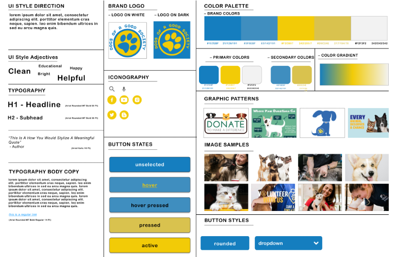
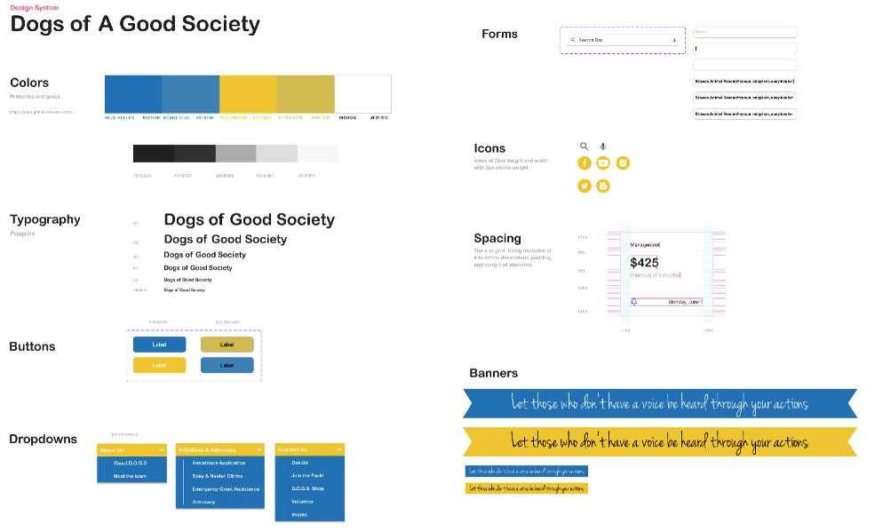
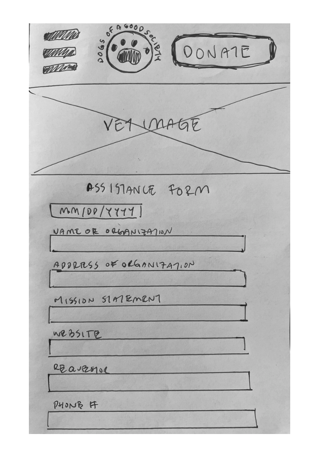
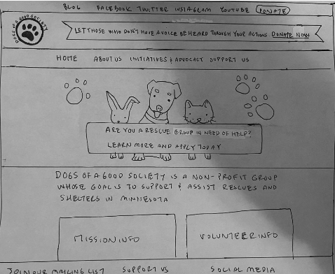
Pen and paper rough sketches of the desktop site along with brand new designs of a mobile version as the site is not currently responsive.
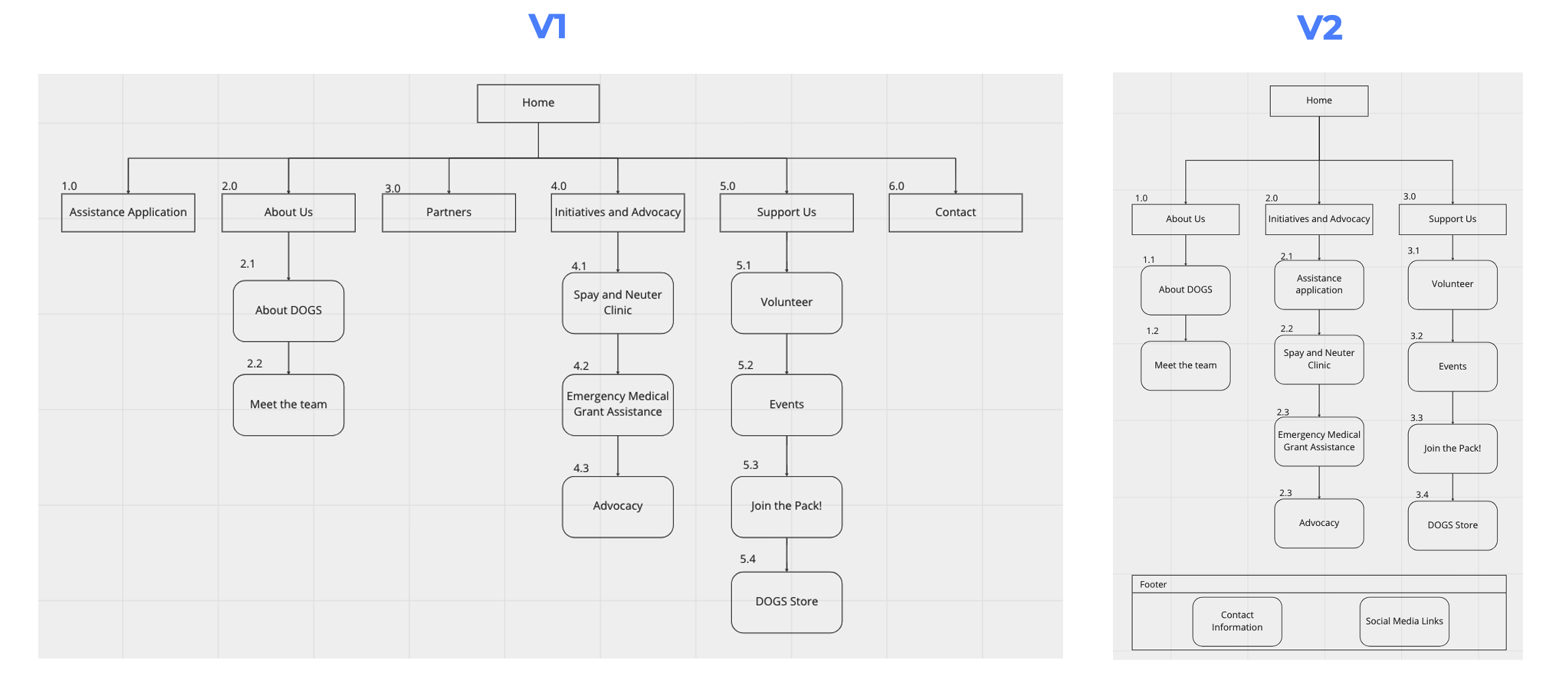
Conducted basic card sorting to organize the three sections that did not have any links in version 1 and placed them into related sections as shown in V2.
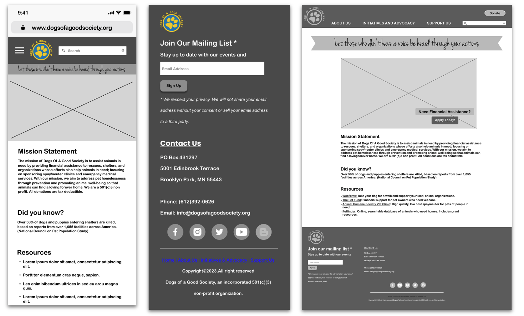
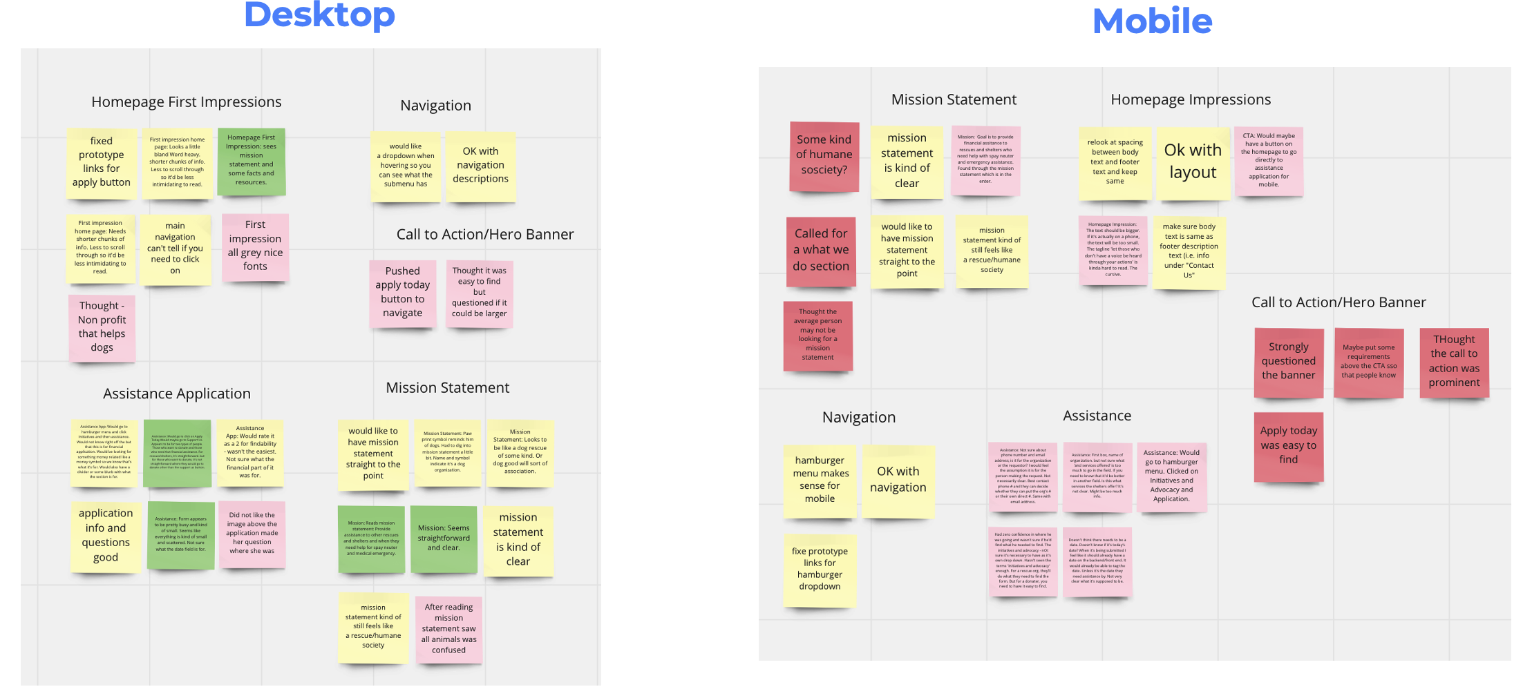
Prior to designing the high fidelity prototypes, I conducted user testing on the mid-fidelity versions. One of the main takeaways from testing was that the banner did not have a clear Call to Action. This feedback was expected as the mid-fidelity was in grayscale and lacked photos. Another piece of feedback was the fact that because the organization is called Dogs Of A Good Society and had a paw print as the logo, users expectedly struggled with knowing that the org helped other types of animals as well.
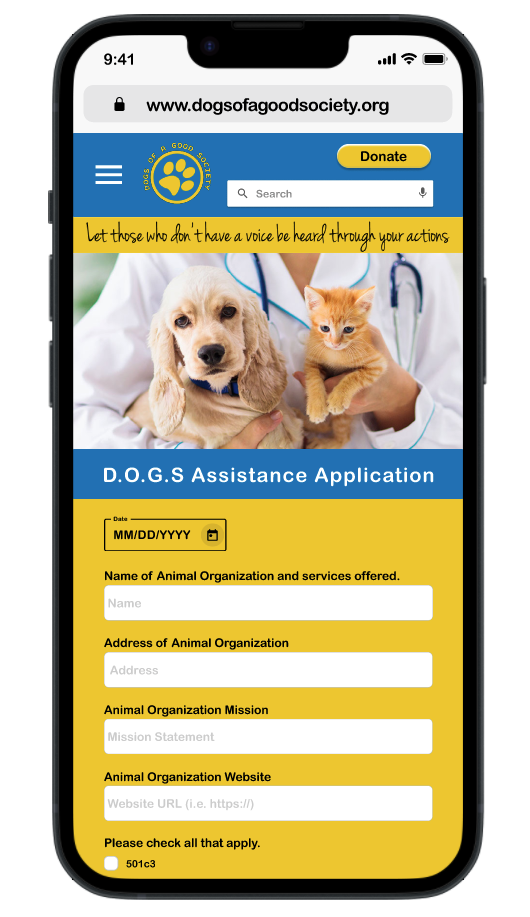
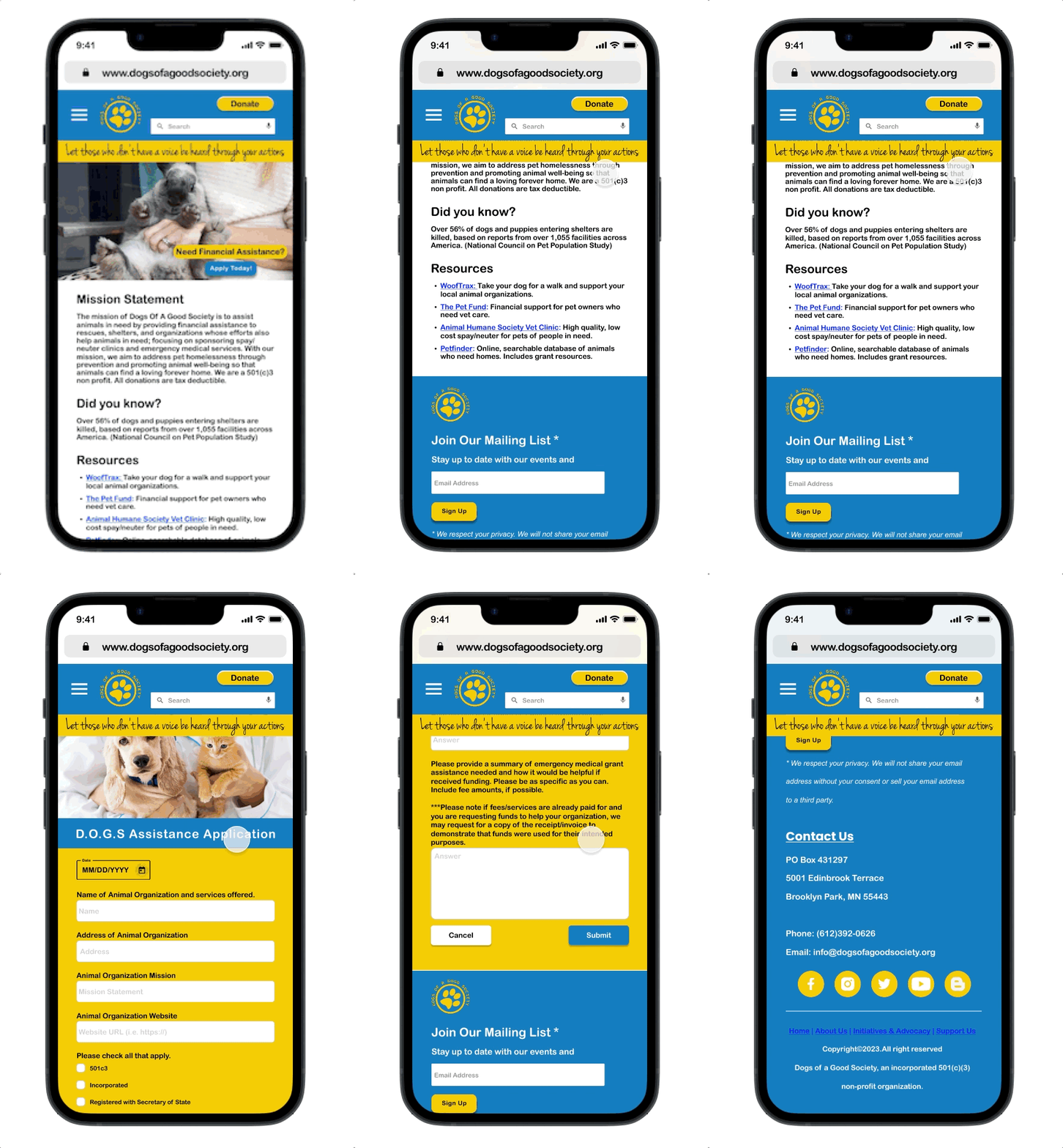
I created two high fidelity versions for AB User Testing. The main difference between the two versions is how we labeled the assistance form and the image we used. We noticed that all of the users preferred the B version, which had the assistance form labeled and an image of a veterinarian. In the carousel hero banner, we put in images of the President's dogs per her request, and also included images of the other types of animals they've helped, like cats, rabbits, and guinea pigs. This was to indicate the organization expanded beyond dogs as users indicated in the mid-fidelity testing that it was unclear.
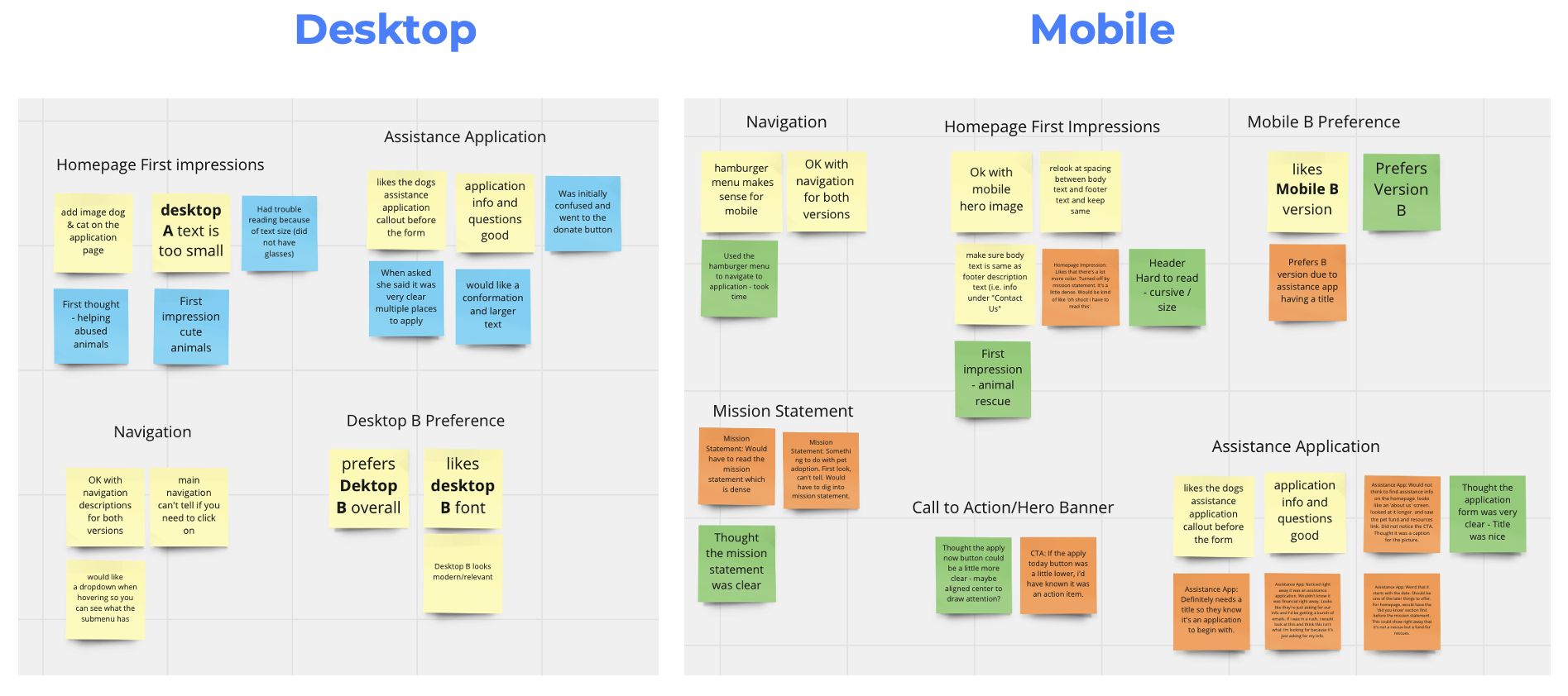
What we heard from users:
Future next steps:
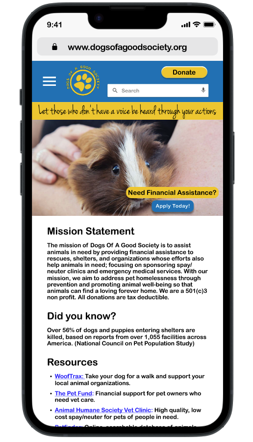
What we heard from users:
Future next steps:
